
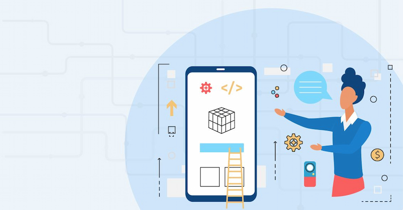
Have you ever felt plunged into a time loop, having to rewrite the whole code for every new project you’re working on? The most annoying part about building a mobile app is resolving the heap of errors on your code, isn’t it? Not only does it waste most of your time, but also makes you seem less productive. Well, you are not the only person dealing with such hurdles. Such tough times call for smart measures and productivity tools that speed up your software projects.
At Webelight Solutions, we are committed to providing developers with better and more productive solutions. We are strongly dedicated to open-source flutter package contribution and building a community that lends support and guidance to rookie flutter developers, who have the drive to learn something new and take every problem as a challenge. That’s why, we are immensely overjoyed to introduce the Master Utility package, your all-in-one toolkit to efficiently solve all your complicated UI and animation tasks.
Developing the Master Utility Package wasn't a walk in the park. Months of labor work went into creating this masterpiece, addressing the very pain points we heard from countless Flutter developers and clients like you, and analyzing flaws in current Flutter packages. Existing solutions felt scattered, sketchy, and frankly, a chore to implement. We said "Enough is enough" and poured our hearts into building a customizable utility flutter development package that would accelerate the development and deployment phases of your project.

Now let’s take a peek at what this package provides you:
1) Done Keyboard View For Android and iOS
It takes care of the absence of a built-in "Done" button on iOS keyboards, which gives a consistent user experience on both Android and iOS gadgets. It provides a handy way to submit text and conceal the keyboard. This makes entering the text easier for a user. You have the option to hide the "Done" keyboard at your convenience, and the flexibility to enable "Previous" and "Next" buttons for smoother navigation between text fields.
How It functions:
- By integrating a line of code into the ”FocusNode” of a text field, the “Done Keyboard View” can be activated.
- An overlay with the "Done" button and optional navigation buttons is displayed above the keyboard when a text field gains focus.
- Triggering "Done" submits the text and hides the keyboard, while "Previous" and "Next" buttons facilitate shifting focus between text fields.

2) Navigation helper
Navigating between screens in your app can get chaotic. This helper simplifies the process by providing functions for pushing named routes, popping screens, and managing navigation arguments.
It provides consistent techniques for navigating between screens and a centralized group of functions to handle common navigation activities in your app that diminish redundant code and improve navigation logic. The descriptive function names make the code easier to understand and maintain. Based on its implementation, it can direct flutter developers to utilize consistent navigation patterns throughout the app.
Here are some of its key functions:
- navigatePop():- Returns to the previous screen in the navigation stack and is commonly used for back button functionality or returning from a detail view.
- navigatePush(route: routeName()):-Pushes a new screen onto the navigation stack & used for navigating to new screens, such as opening a settings page or examining a product detail.
- navigatePushReplacement(route: routeName()):-Pushes a new screen while removing the current one from the stack & prevents users from navigating back to the replaced screen.
- navigatePushRemoveUntil(route: routeName()):-Pushes a new screen and removes all previous screens from the stack until a specified route is reached. It is useful for deep linking or resetting the navigation flow to a specific point.

3) Sizer helper
You can simplify responsive design with the help of size helper. It provides a much simpler way to create layouts that can adapt to various types of screen sizes. It also introduces extensions for double values that give developers the liberty to specify dimensions, as percentages of screen width and height. By using percentage-based values, layout code becomes easier to understand.
How It functions:
- You can call “Size.Helper.setMediaQuerySize()” within your app's first widget's build method to initialize the Size Helper.
The extensions feature adds extensions to double values for:
- .w: Denoting a percentage of the screen width.
- .h: Representing a percentage of the screen height.
- .fs: Showing a font size relative to the screen size when implemented.
You can also use these extensions to set dimensions and font sizes in their widgets, ensuring they scale proportionally to different screen sizes.

4) Image Picker Helper
In contrast to other packages that offer fragmented functionalities for images, videos, and documents, the Image Picker helper consolidates them into a single solution. You will be able to access multiple capture and selection options (camera, gallery, video, document) through a unified API, reducing code intricacy and upkeep. By incorporating multi-media and customized pickers, you can customize the selection process as needed. It supports mobile app development on both Android and iOS, eradicating platform-specific implementation challenges. Combining the picker with other features in your package, such as resizing or compression, could provide a more extensive multimedia solution.

Some of its methods:
- For iOS, add the provided code to your “info.plist” file to explain why your app needs access to the camera, microphone, and photo library.
- You can use ImagePickerHelper.multiMediaPicker() to display a picker offering all options (camera photo, gallery photo, camera video, gallery video, and document). The returned value “result” provides information about the chosen media type and the file path.

- You shall use ImagePickerHelper.customMediaPicker(pickerActionType) to specify the desired media type through the “pickerActionType” enum. The returned value “result” remains the same as in the multi-media picker.

5) Date time helper
Formatting dates and times can be confusing and error-prone. This helper offers various functions to format dates, times, durations, and even relative time differences. You would be able to format dates and time in various ways, reducing the need for repetitive code. The date time helper offers the “DateTime” class with custom methods. This makes formatting way more easier for flutter developers.
How It functions:
- The helper adds a custom method called toCustomFormatter() to the “DateTime” class.
- You can call this method on any “DateTime” object, passing a “formatter” argument to specify the desired format.

6) Auto-size text helper
The Auto size text helper will automatically balance the font size of your text that it contains to fit within its available area. Starting from the original size, "AutoSizeText" would cycle through smaller font sizes, with a specified increment, until it locates the smallest size that accommodates the entire text within the space provided. Once the appropriate font size is identified, the text is exhibited at that size.

Here's what you can do:
- Just utilize the "AutoSizeText" widget just like you do with the standard "Text" widget. It can go through various font sizes.
- You can set "minFontSize" and "maxFontSize" to set the acceptable font size range, ensuring the text remains within appropriate boundaries.
- The "presetFontSizes" parameter allows developers to define a selection of preferred font sizes, steering the resizing process toward specific values.
- The "group" parameter enables developers to cluster multiple "AutoText" widgets to ensure consistent resizing, sustaining a harmonious balance across various elements.
7) Toast helper
Toast Helper is a method that is used to show a toast message on the screen. Use it when you need to show a message to the user, to let them know that an action has been completed successfully. The Toast Helper can guide you by providing a way to easily show messages to the users without having to create their custom toast widget. This can save time, and effort, and can also help to improve the consistency of the look and feel of toast messages across an app. Toast Helper is a simple and efficient way to show informative messages to users without cluttering up the app's UI.
This Toast Helper can be used in two ways:
- By calling the “showToast” method with a message.
- By calling the “showCustomToast “ method with a message, background color, text color, font size, and gravity.

Methods and Usage:
showToast({required string message}):
- It would display a basic toast with the specified message which uses a default styling and positioning.
- It is the ideal choice for quick & simple notifications.
showCustomToast({...}): It provides customization options.
- backgroundColor: It sets the background color of the toast.
- textColor: It lays down the text color of the toast.
- fontSize: It calibrates the font size of the toast text.
- gravity: It controls the positioning of the toast on the screen ( e.g., top, bottom, center ).
8) Email Dispose helper
The Email Dispose Helper would help you check whether an email address is disposable or not. Disposable email addresses are often used by spammers to create fake accounts. You can help prevent spam from being sent to your app by checking whether an email address is disposable or not. It helps prevent users from creating multiple accounts with disposable emails. Email Dispose Helper works by using an email dispose checker API. This API needs an email address as input and returns a response that denotes whether the email address is disposable or not.
How It Works:
Checking an Email:
- Developers can call EmailDisposeHelper.emailDisposerChecker(email: ...) with the email address to be checked.
- The function returns a “Future” that resolves to an “EmailDisposerResModel” object containing the result.
Result Interpretation:
- The “result.disposable” property indicates whether the email is considered disposable (true) or not (false).

9) Log helper
Tracking the flow of execution and identifying bugs in the code becomes easier to interpret with the log helper. By embedding clear logging statements, it presents the code as more self-documenting. It would let you control the kind of messages that are logged and their visibility. There are various methods that come along with it, for logging your information. These methods are useful for debugging the errors in your code and tracking the flow of your mobile application.
Different Logging Levels:
- LogHelper.logInfo("..."): It logs general informational messages.
- LogHelper.logSuccess("..."): It logs successful events or operations.
- LogHelper.logWarning("..."): It logs anticipated issues or warnings.
- LogHelper.logError("..."): It logs errors or critical problems.

10) Dialog Helper
Using the dialog helper, you can show various kinds of dialog messages with ease and minimum lines of code. There are several other pre-built dialog options and customizable elements to suit your demands. The code becomes more concise and easier to interpret as we have used descriptive method names and hidden implementation details.
This feature allows you to show various types of dialogs with ease and minimal code. It provides several pre-built dialog options and customizable elements to suit your needs. It makes code more concise and easier to understand by using descriptive method names and hiding implementation details.

What else does it have:
Pre-built dialogs:
- AlertDialog is a standard alert dialog with a title, message, and optional buttons.
- ConfirmationDialog is a dialog asking for confirmation with choices like "Yes" and "No".
- LoadingDialog is a progress indicator dialog to show loading behavior.
Customization options:
- By Styling, you can customize the appearance of the dialog elements like background color, button styles, and text styles.
- With content, you can define the title, message, and icons for each dialog type.
- By callback actions, you can define actions to be taken when buttons are clicked in the dialog, offering responsiveness and interaction.

11) Cache network Image Helper
The Cache network image helper is a widget that efficiently grabs and displays images from the internet. It caches downloaded images locally for faster subsequent loads and manages cache storage to optimize performance and memory usage. It can also handle loading states and errors. Cached images can be displayed even without an internet connection.
How it works:
- During First Request, it checks if the image is already cached or not. If the image is not cached, it downloads it from the URL. It hoards that image in the local cache and can be used at some point in the future.
- It retrieves the image directly from the cache, avoiding network calls.
- If for some reason, the image loading fails, it displays a provided error widget.

12) Validation helper
Validation helpers can be used for validating emails, passwords, phone numbers, credit card numbers, and more. It provides a method called “validate email” that can be used to validate whether a given string is a valid email address or not. It lets you create your own validation rules for specific needs and works efficiently with form fields and their "validator" properties.
Functionalities of a validation helper:
- It validates whether the string entered by used matches a specific format or not, for e.g. email addresses, URLs, phone numbers, dates, or specific alphanumeric patterns.
- It verifies that user input meets certain criteria, such as minimum or maximum length, allowed number of characters, specific values, or logical constraints.
- You can build custom validation logic using provided methods or libraries to address the specific needs of your application.
- You can also generate user-friendly error messages in case of invalid input. The error message would explain the nature of the issue and how to fix it.

13) API Helper
API helper is used to make API calls. It can be used to make GET, POST, PUT, and DELETE requests. It performs automatic data parsing by converting response data to usable formats and reports API errors with clear messages. It allows developers to focus on business logic rather than low-level networking details. Having a custom tool like this would accelerate AB integration and testing.

Features:
- It sets a common base URL for API endpoints.
- It makes use of the API request class to encapsulate request details (method, URL, Parameters).
- It also offers you methods for GET, POST, PUT, and DELETE requests.
- It parses JSON responses, manages the errors gracefully and provides access to the data.


14) Shared Preference Helper
This helper is used to dumb down and refine the use of shared preferences for storing and retrieving data and accelerates development tasks that involve local data storage. It acts as a mediator between your code and the primary shared preferences mechanism, typically provided by the operating system or framework. It provides a convenient wrapper around the underlying “shared_preferences” package. This makes the user interface more intuitive.
Features:
- It requires Requires a one-time initialization in the “main” method using “ await PreferenceServiceHelper.init(; ”
- It supports storing and retrieving various data types(Strings, Booleans, Integers, Doubles).
- It uses key-value pairs for organization and retrieval.
- It offers functions to remove individual values or clear all preferences.

Here you have it! The Master Utility Package will become your go-to solution for handling tasks and taking your efficiency in Flutter development to the next level. We are confident that it will be your choice to create mobile apps and software projects among the various paid Flutter packages available on the web.
What's even better? It's an open-source package. We believe in pushing developers to be a better version of themselves at all skill levels, which is why we share our creations with the world. Unlike paid options, we encourage you to utilize this open-source package. If you come across any issues or have suggestions, we would love to hear from you! Feel free to report them on our GitHub repository. We are also here to learn, just as much as you are.
Share your expertise. Join a community shaping the future of Flutter development. Try out the Master Utility package and its functionalities. Visit our page to explore the documentation.